With J Photography brand design
Illustrator | Photoshop | Canva
I rebranded my photography business, With J Photography. This project included brand strategy, logo exploration, typography and color palette development.
goal
Create a brand identity that feels aligned with the heart of the photography business.
problem
The previous branding didn’t reflect the warm and timeless nature of the work.
outcome
A softer, earthy, personality-driven identity with a flexible and natural visual system.
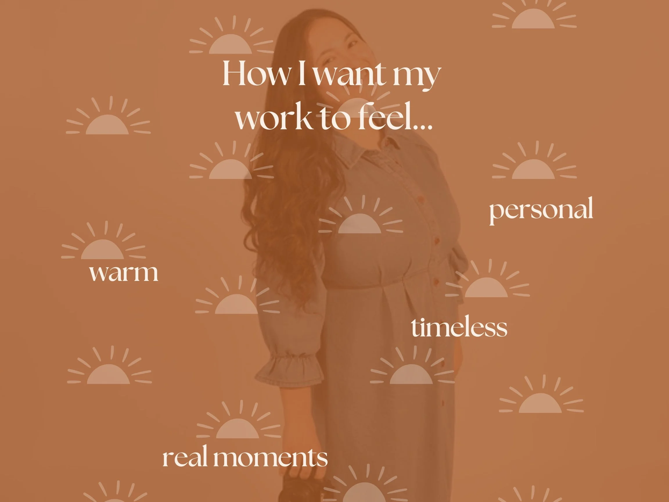
Brand direction
Before designing, I defined how I wanted the brand to feel. These emotions guided every creative decision throughout the process.
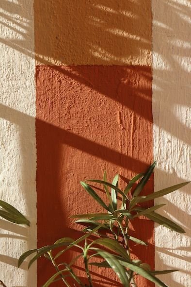
Inspiration &
Visual References
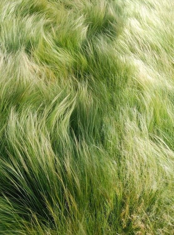
I gathered inspiration from organic textures and soft visuals. I was drawn to branding that felt natural and timeless rather than overly polished.
Sketching & Early Concepts
I explored multiple logo directions by sketching wordmarks, initials, badge concepts, and handwritten variations. This stage helped me test what felt most personal and recognizable before moving digitally.
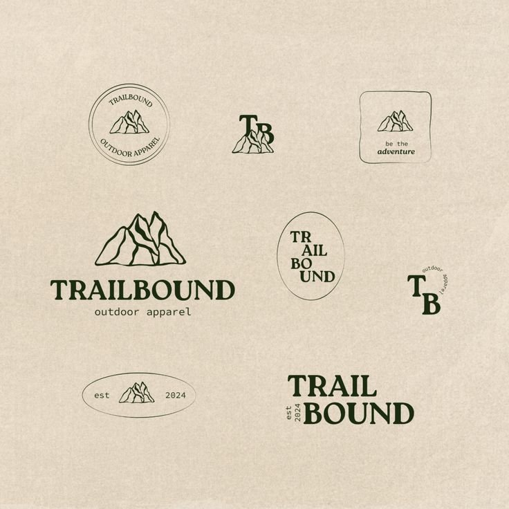
Logo Development
The final identity centered on a soft, approachable wordmark paired with supporting logo variations. I tested typography, icon directions, and layout combinations to create a system that could work across social media and brand touchpoints.

Primary Logo

secondary logo

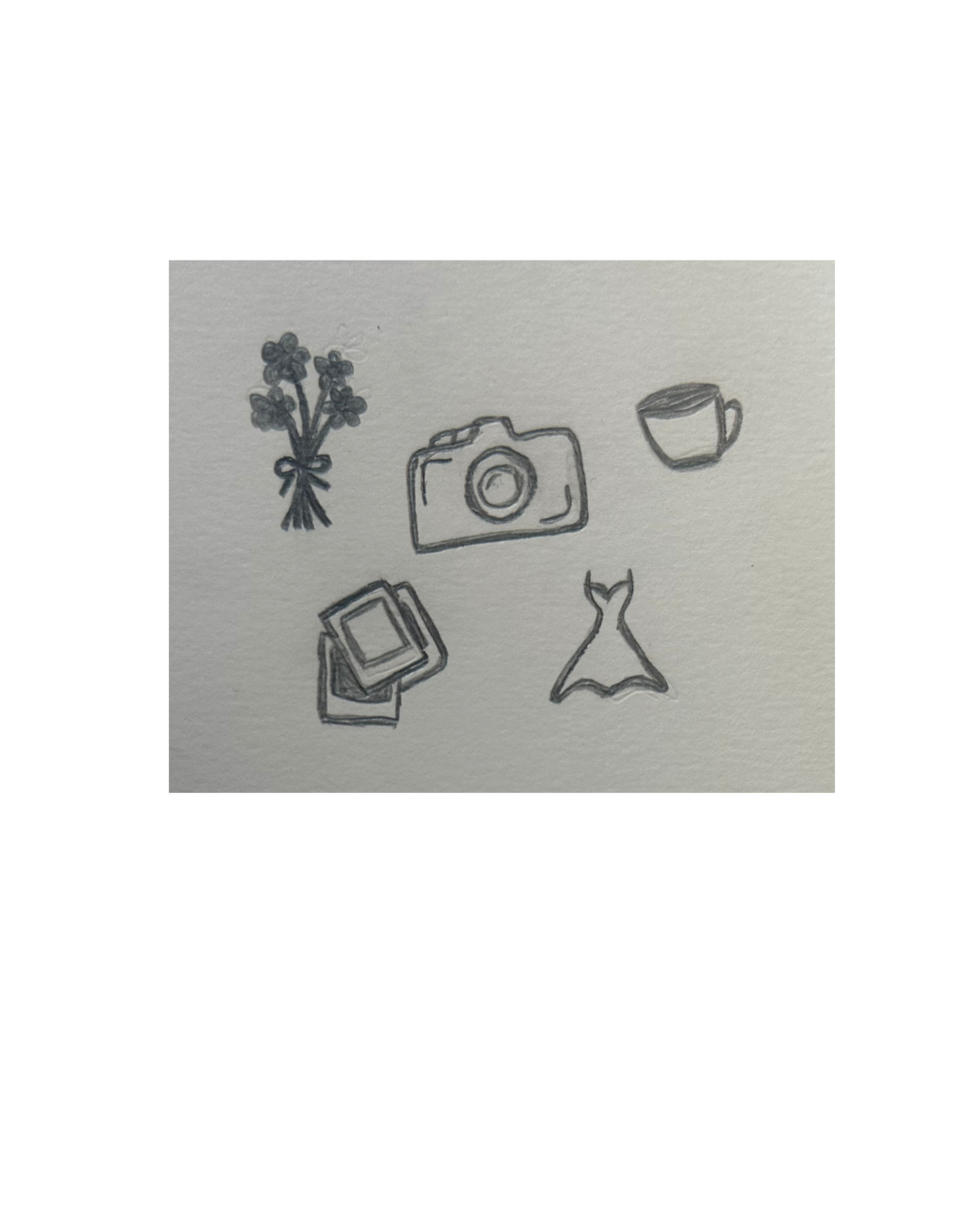
Iconography

color palette
The palette was inspired by nature and chosen to support a warm, grounded, and timeless brand presence. The earthy tones reflect connection, softness, and organic storytelling.

typography

This combination allows the brand to feel professional while still reflecting the personal quality of the business. It is important to note that it was important to use Type Faces available on Canva for photographer’s use.
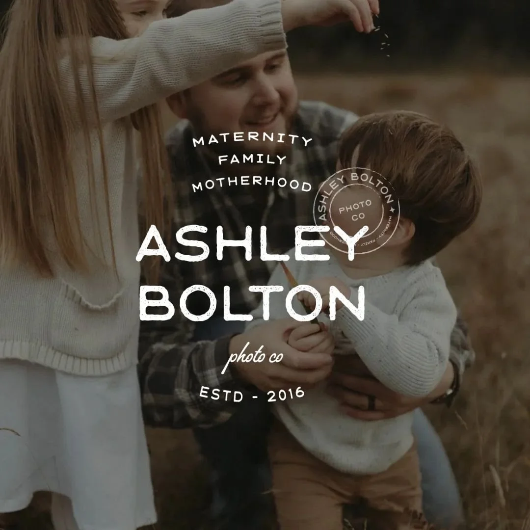
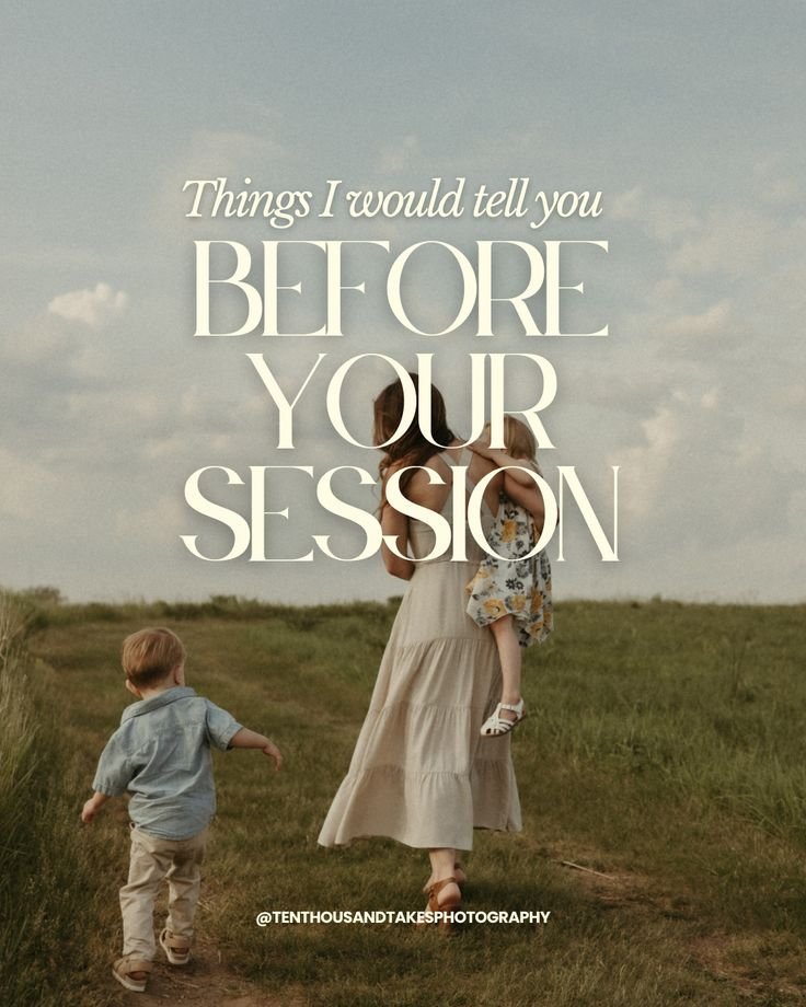
brand In use


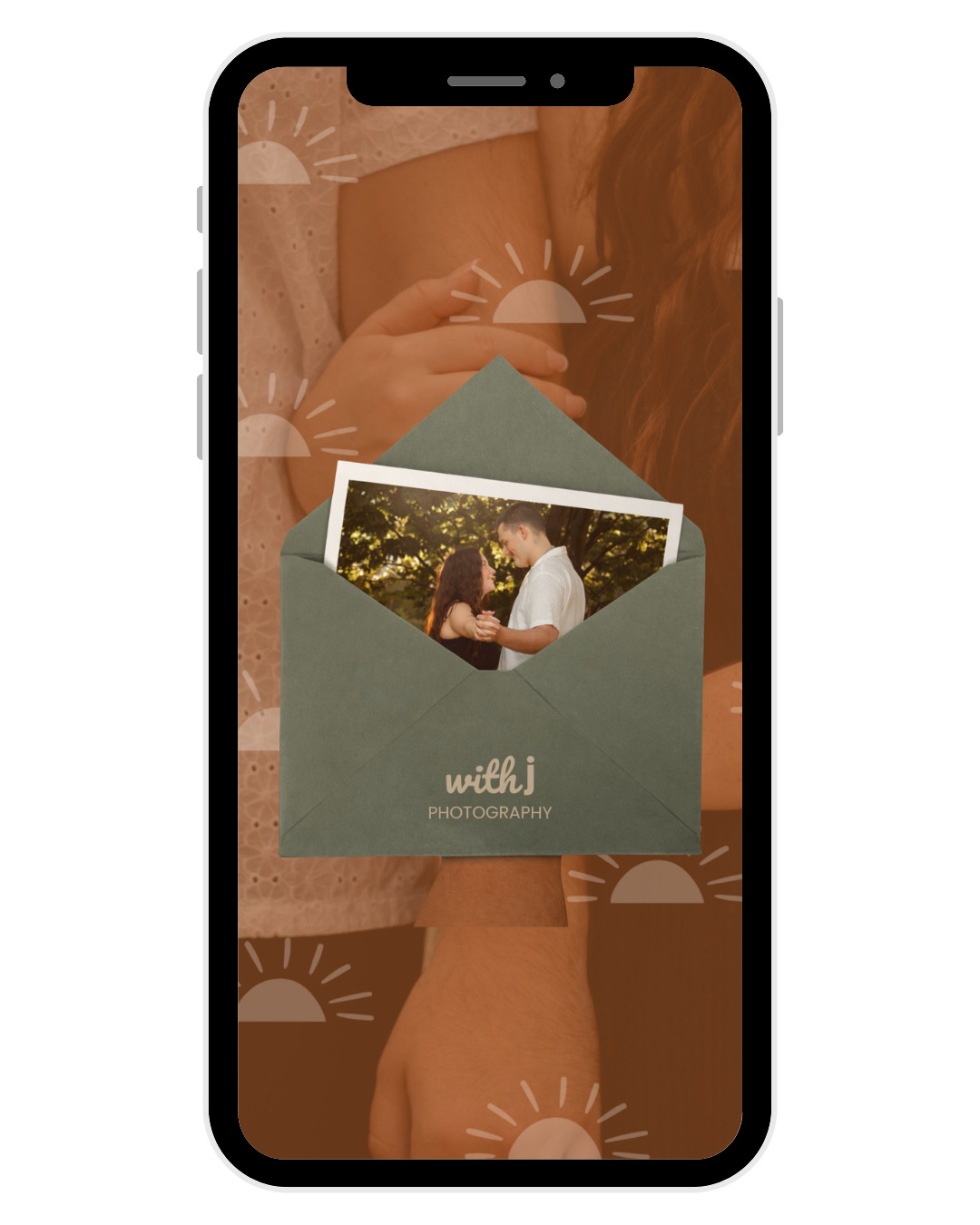
The final brand system was applied across key client-facing touchpoints to ensure a cohesive and recognizable experience. From social media to client materials, each element was designed to reflect a consistent visual identity rooted in neutral tones, intentional typography, and a warm, lifestyle-focused aesthetic. This consistency allows the brand to feel polished, trustworthy, and aligned with the overall client experience.